Designing a personalized piece of jewelry is about more than just creating a material object — it's about telling a story. When a client asked me to create a special ring for him, I knew it would be a unique project. This wasn't just about making a ring; it was about crafting a symbol of identity and personal meaning. From the initial sketches to the final touches, each step was focused on bringing that story to life through thoughtful design.
What my client wanted specifically was a tiger signet ring for his pinky finger. He wanted the design to be classy, sharp and interesting, and for it to be understated, so that it would remain an accessory and not call too much attention to itself.
I started by reaching out to one of my jewelry industry contacts, Adam from James Banks Design. He and his partner Heidi were thrilled to work on the project, so my next step to look for images of tigers as inspiration for the design. I sent several images to my client, and we settled on the one below.
Image unsourced; please contact me if you know the source so that I can give the associated credit.
Once we had the design inspo, we then needed to decide if we wanted the ring to be engraved or carved. See below for examples of each style. Engraved (via Todd Daniels Design) is on the right; carved (via David Yurman) on the left. As you can see, carved designs are a lot more involved. It’s extremely detailed work — like a small, wearable sculpture.
Below is an example of a hand-carved ring the designer did for Timothy Chalamet to wear in the movie Dune. Once we saw this sample, we knew we had made the right call on going engraved because my client wanted a rich, nuanced look.
The Dune ring is beyond cool, but I knew it was too busy for what he wanted. We didn’t need all of that detail on the sides, and I knew he wouldn’t want it to be black, as that would make it pop too much on his finger.
Part of the challenge for me with this project was in coordinating between the designers (who are very visual, like me), and my client. I need to be able to describe a tangible object that both the designers and I could envision, but using words to help the client visualize what was in our minds. This was especially the case because this client is extremely busy and makes fast decisions. So I needed to be efficient and ultra clear in my language to make sure he understood what he was saying yes or no to. That way, he could make the best possible decision to guide us toward our end goal of creating an extraordinary ring that he would treasure.
Above are a few more inspo images the designer sent to me, but we didn’t really vibe with any of them. Sometimes you need examples of things you don’t want in order to dial in what you do want. With these images in mind, we decided that we wanted the engraved style from the lion ring but in the shape of the bee ring from the first set of sample ring images I shared above. Below is the tiger artwork the designer created for the engraver based on our guidance.
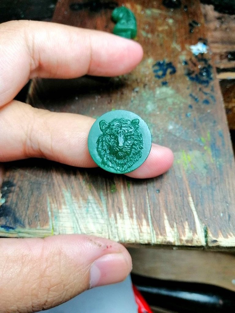
Once we approved the artwork, the engraver then created a wax based on that, which the designer then needed to fit to the shape of the ring. And below is the tiger that they carved.
The mold above was so cool, but I was concerned that there was too much fur around the neck, making it look more like a wolf-man as opposed to a tiger. So I asked Adam to reduce the fur slightly. Below is what he and Heidi sent back, which I found much more tiger-y.
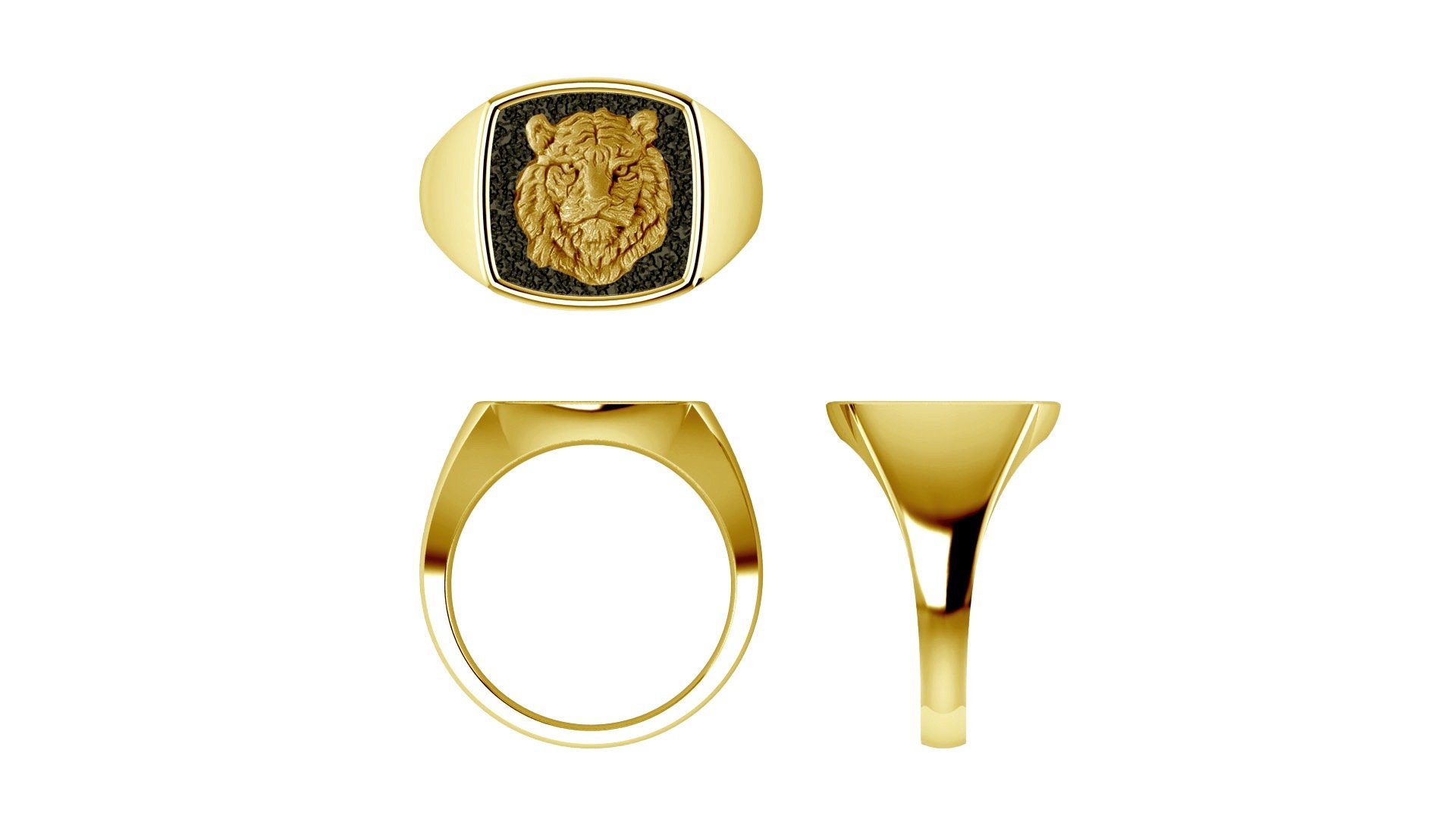
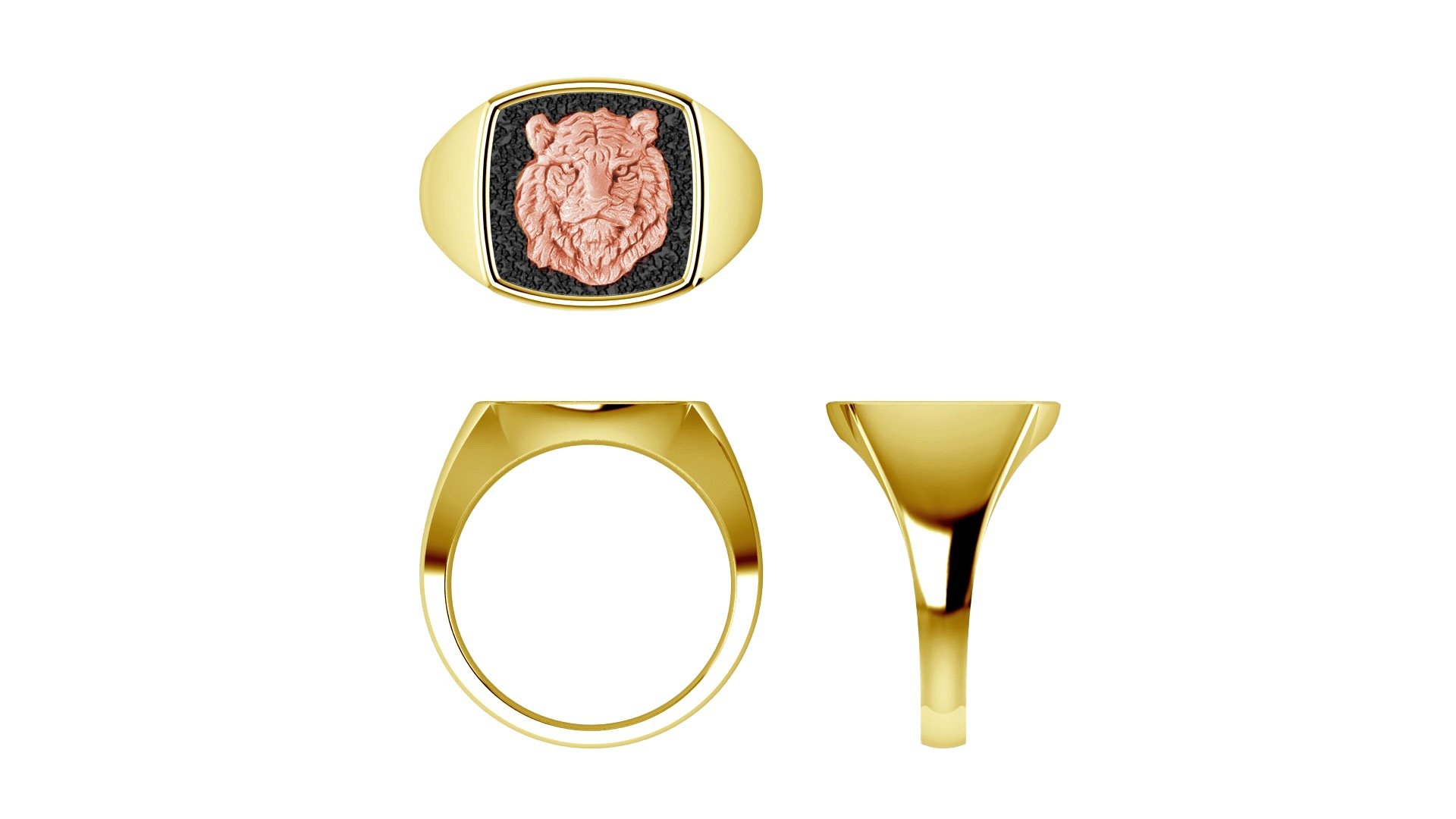
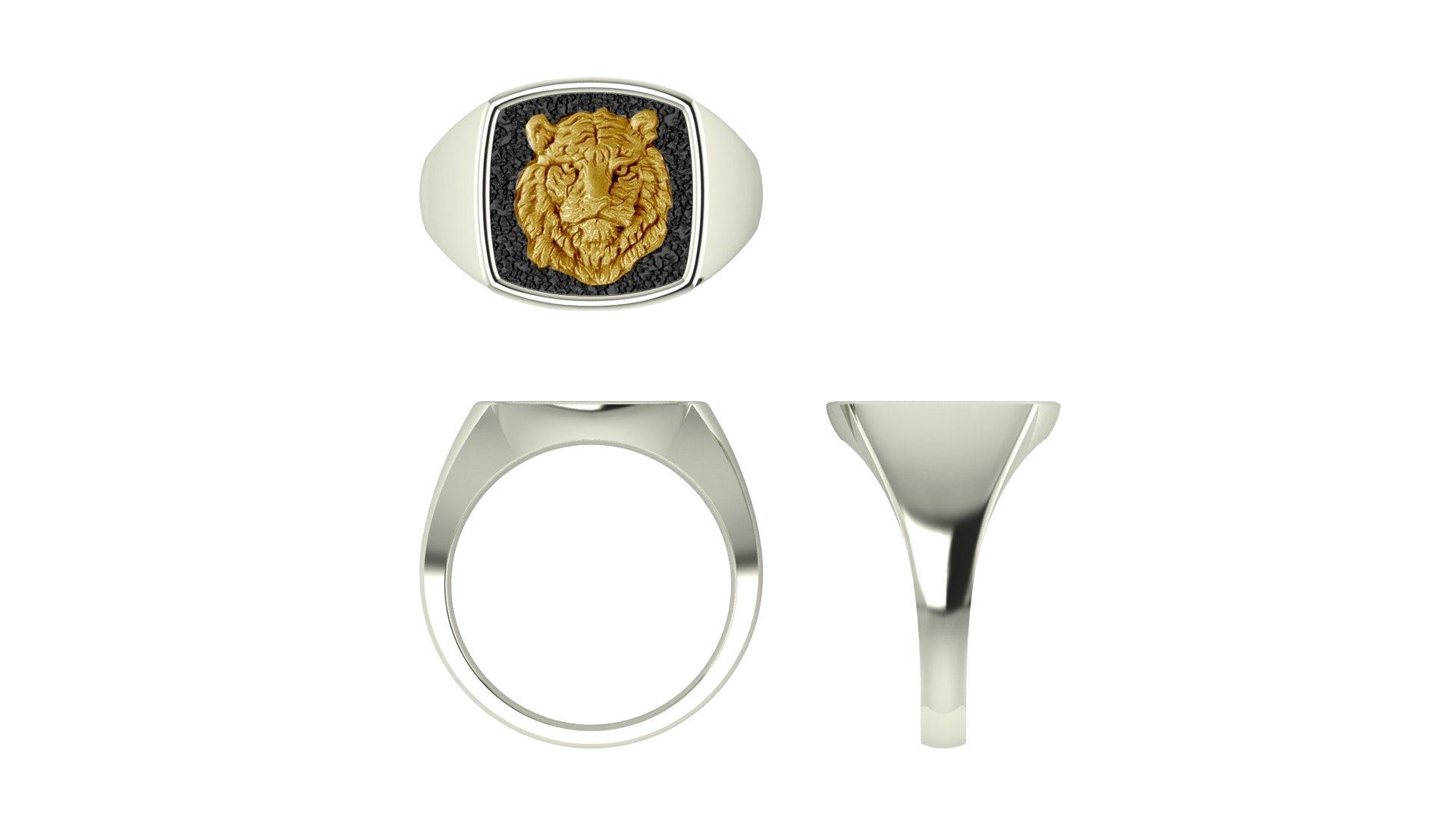
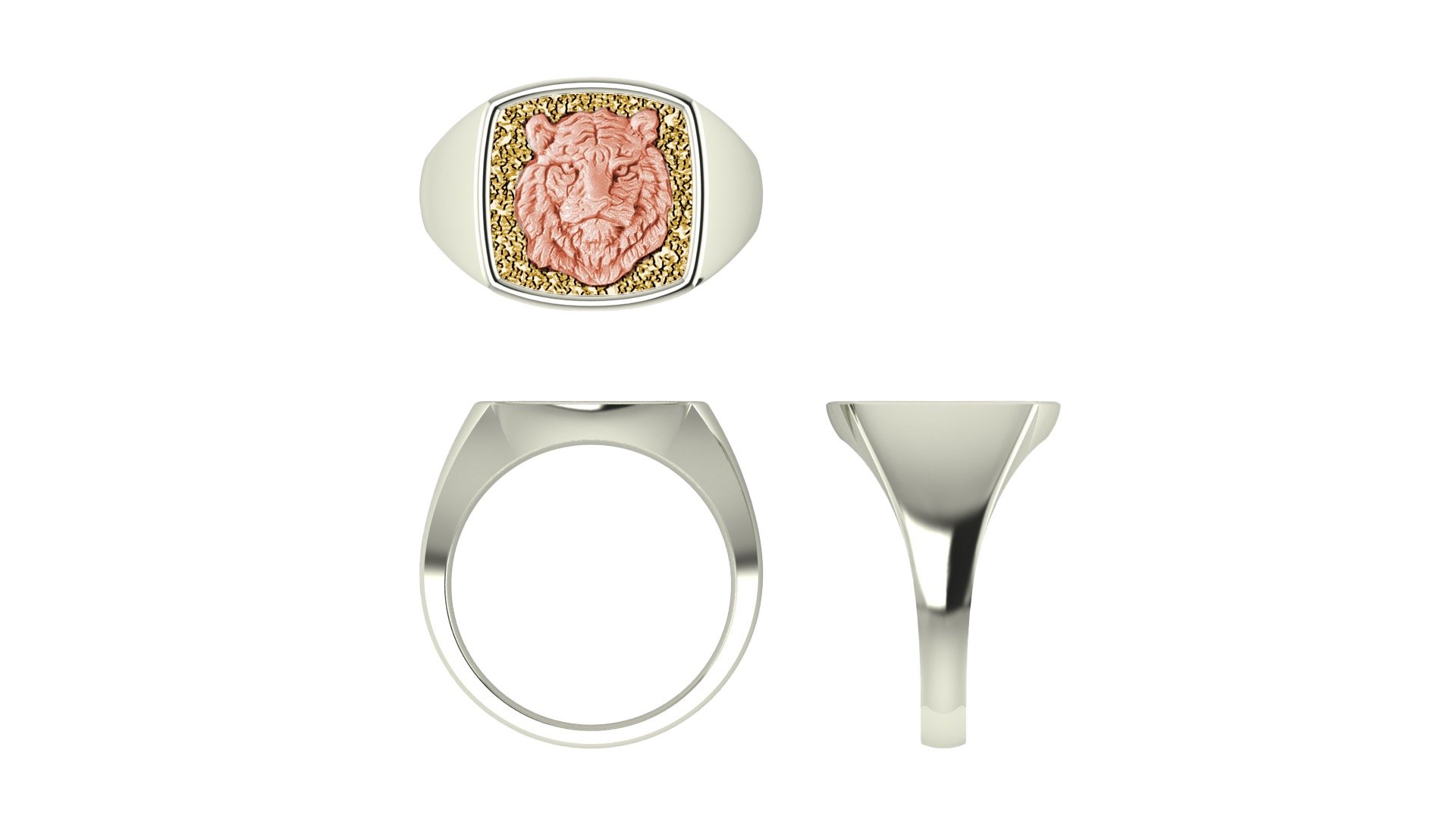
The client and I approved the design, so our next step was to select what color gold to use. The design team drew the approved tiger into the ring cad so that we could see it with various combinations of metals for the three components (ring, tiger, and background behind the tiger). Below are the renderings.
Adam told me to ignore the “bumpiness” in the backgrounds behind the tigers in the renderings and also that the tigers would fill the space more in the final version, so we wouldn’t see as much of the background. The rose gold felt too feminine for our purposes, so we narrowed our choice down to the first and third options above — yellow gold tiger, onyx background and white or yellow gold ring.
It was a hard choice between the two though. In situations like this, when a client is on the fence about something that we’re customizing (also rare for this client who is beyond decisive!), I try to come up with verbiage that the client will resonate with to describe how the item will read in its final form. In this case, what I told him was that the yellow gold has a classic feel and a richness about it; whereas the white gold conveys a more modern and youthful feel. (Paul Newman or Steve McQueen would definitely have gone with yellow gold!) With that in mind, the client opted for the yellow gold ring and tiger with the onyx background, for a timeless feel.
Above was the next step, after which the stone would go on, and it would get polished.
In the end, the client was thrilled. In his words, it’s “subtle, elegant, and not overstated.”
From my side of things, it was a pleasure to be able to flex my creative muscles while working with such a talented team at James Banks Designs. They really went above and beyond to make sure the client was happy with the final piece. And the bonus for me was that I got to create something that my client loved, which is what fuels me always. He actually reached out to me years later to ask for another of the same ring to be created, but in rose gold, for his wife. Apparently she wears his ring all the time, so he wanted to get one for her!


